What is it?
What is a gallery that specializes in Contemporary Realism doing writing about abstraction, you ask? Well here’s the thing– when people think of the term “abstract art,” most people specifically think of non-objective art. The two do have overlap, but the realm of abstraction is a lot more nuanced than just pure realism and pure non-objective art. The work that we show here at the gallery is nearly always, representational, or objective, meaning the artwork is “of” something. As you may remember, we’ve discussed the “spectrum” of realism on this blog before, and talked about some art being more hyperrealistic, some art more painterly, some very abstracted, and some non-objective. Non-objective art does not seek to portray anything that exists in reality; rather, it communicates purely on a visual level, using the elements and principles of art to create something aesthetically interesting. Other styles, like Hyperrealism and Photorealism, attempt to portray reality in its exactitude, or at least in the case of the latter, how it appears in photographs. But there is a whole world of art that also falls in between the two. Abstraction in art is any deliberate step away from portraying exact reality. Abstraction in objective art, or art that does seek to portray or represent something found in reality, involves some level of alteration, usually a kind of simplification of the object into its most essential shapes, colors, or lines. But enough of the talk, let’s start looking at visual examples!
Examples in art history:
If we look at the entire history of visual art, we can see that the prevalence of abstracted art is very high toward the beginning, slowly lessens to nearly none at all for many, many centuries, and then rockets back up in the 20th century. For a long time, the “goal” in the creation of art was either minimal abstraction or pure abstraction, depending on what was in vogue. In the post-modern world we inhabit now, a vast range of visual art styles are now accepted and encouraged. Let’s take a look at examples of abstraction through the years:
Abstraction, as a movement, didn’t officially begin until the early 1900s, however artists were unknowingly experimenting with the idea of “abstract art” centuries before. Artists were finding new and innovative ways to express themselves and their emotions without categorizing their work under the field of abstraction. Looking back at the artistic culture of Native Americans, it’s apparent that they began making pottery over 2,000 years ago. Certainly, over time, their decorations became more and more elaborate, lets examine the example shown above.
The specimen on the left (fig. 1) is a piece of pottery traced back to the Seminole Tribe of Florida, a tribe that can be traced back 12,000 years. The exact date of this specific example is unfortunately unknown so lets simply focus on the elaborate and abstracted details within this gorgeous piece of pottery. The characteristics of Native American pottery typically include animal or bird patterns, geometric patterns, and color schemes that may be polychromatic, black on cream, or black on black. The meanings behind these specific symbols remain secret to the tribe. However, their artistic choices share the qualities of abstraction in the way the bird is stylized and more geometric than an exact representation of the true anatomy of a bird.
- SOLD
Now lets turn our attention to 7th century China! China was ruled by the Tang Dynasty from 618-907 and a famous painter named Wang Mo created a “splashing ink style” of painting. Sadly, none of his work survived, but fast forward 53 years to 12th century China during the Song Dynasty (960-1279) a painter named Liang Kai reinvented Wang Mo’s “splashing ink” method. Utilizing this technique Kai created one of his most famous works, Immortal in Splashed Ink (fig. 2; see above). This technique resulted in a loose appearance in the ink and very little detail, in this piece we get the essence of a male figure, but a figure without facial detail, without an identity. What’s intriguing here with Mo, Kai (more of his work shown below), and the Native American’s approach is how these appear to be visionary, possibly unintentional choices that represent a movement that arose centuries later. Were they intentionally searching for new art techniques? Were they surrounded by a style that they found dull and wanted something different or did they simply feel it was just a way they could express themselves and the world around them?
There are many more early examples, but too many for us to discuss here, so time to turn our attention to some more modern examples!
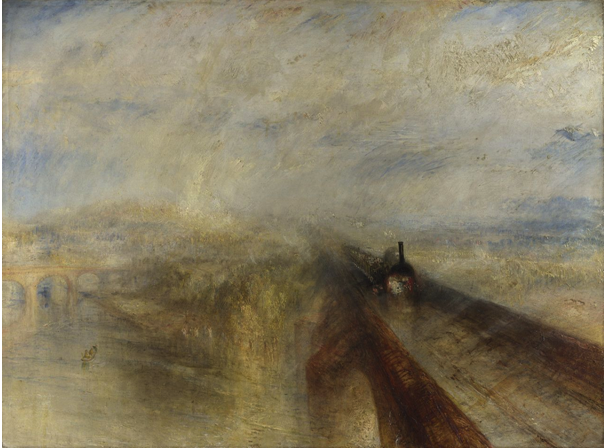
figure. 9 “Rain, Steam, and Speed” J.M.W. Turner; 1844; National Gallery of London
Joseph Mallor William Turner (J.M.W. Turner) was an extremely talented British artist who enrolled himself into the Royal Academy of Art Schools at a very young age. He exhibited his first watercolor at the Royal Academy at the age of 15. As his career progressed he began utilizing oils and created extremely rendered works, but as he got older his art became more representational. His famous work Rain, Steam, and Speed (fig. 9; see above) exemplifies Turner’s progressive abstracted style. Instead of trying to emulate reality he chose to express emotions by modifying colors and shapes. In this composition we can only translate familiar shapes such as a train or the bridge in the far left, but the rest of the composition needs to be deciphered.
Often when it comes to art, viewers search for the familiar and so often abstraction is motivated by realism therefore viewers sometimes find themselves asking..why? They ask why the artist chose to distort, vaguely represent, rearrange, or adapt a subject. Sometimes there’s an answer to that question and sometimes the intentions behind a work of art remain a mystery.
Above, we have two, highly familiar forms, but the way they’re arranged raises questions. On the left, William Kandinsky’s Circles in a Circle falls under the category of “geometric abstraction,” because he utilized one of the most basic shapes, the circle, to compile his composition. To viewers, the painting is deciphered as a combination of circles and lines, but Kandinsky valued circles because he believed that the circle had “cosmic significance.” He felt that specific colors and shapes triggered emotions and when those colors and shapes are combined they symbolize “harmony of the cosmos.” In his words; “The circle is the synthesis of the greatest opposition. It combines the concentric and the excentric in a single form, and in balance.” Kandinsky also wrote a letter in 1931 that said Circles in a Circle was “the first picture of [his] to bring the theme of circles to the foreground.”
While Kandinksy was searching for harmony and meaning behind colors and shapes, 29 years later Henri Matisse, who was considered the greatest colorist of the 20th century, used colors and patterns to deliberately make viewers uncomfortable. In addition to color, Matisse valued the human form. He often fragmented the figure in harsh ways, but he also worked in a curvilinear method. It all depended on the behavior and personality of the models he worked with. They essentially served as extensions of his own personal emotions. You can find some further examples of Matisse’s figurative work, from the same 1952 Blue Nude series below.
The most appealing aspects of abstraction is the way it has progressed over centuries and how so many artists found and are still finding a way to change the way we perceive ordinary objects and forms. Artists become inspired by those who came before and enhance those original ideas.
Certainly the timeline of abstraction expands much further than Henri Matisse, but lets examine how abstraction is being incorporated into work here at Principle Gallery!
Examples at Principle Gallery:
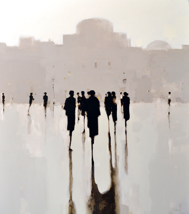
figure. 16 “Study 15 People” 32×28, oil on board by Geoffrey Johnson – available at Principle Gallery
We are currently in the final days of Geoffrey Johnson’s Solo Exhibition therefore it’s the perfect time to discuss how Johnson exemplifies abstraction in his work.
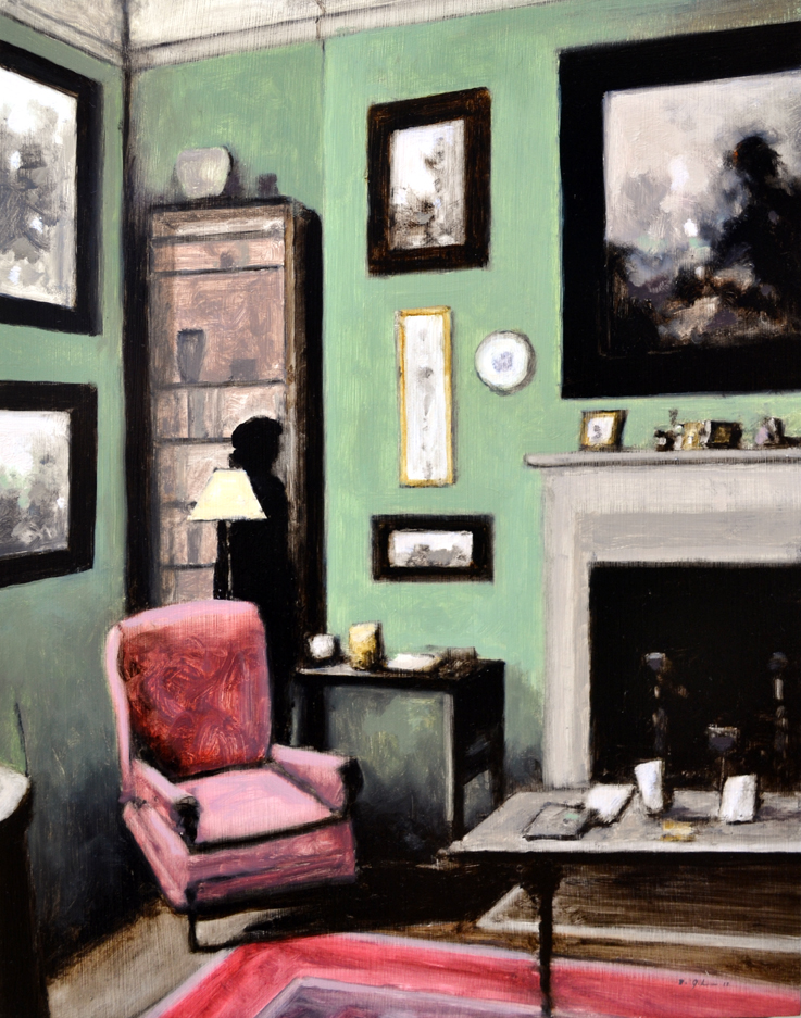
figure. 17 “Velvet Chair” 18×14, oil on board by Geoffrey Johnson – available at Principle Gallery
A major staple in Johnson’s work is the way he gives his figures a ghostly presence. They’re depicted extremely thin and without an identity, which remains to be a major draw to his work. The human form is distorted and Johnson’s figures can be compared to the unique structure of the sculptures by Swiss sculptor, Alberto Giacometti.
Above, in a comparison of a 20th century Giacometti to a modern Geoffrey Johnson you can see the extreme similarity in the abstract rendering of the figures. Giacometti sculpted his figures as thin as he possibly could, he also did the same thing with his animal sculptures. Another strong comparison between the two is the presence of mystery and a skeletal impression.
Like Giacometti, Johnson has a serious interest in the human body, but he also finds interest in strong, unique architecture, that’s often found in New York and in other fast-paced cities. Both Giacometti and Johnson exhibit movement in their work, Giacometti in a more static manner while Johnson captures the way people move through cities. However, Johnson showcases movement in his cityscapes more so than in his interiors.
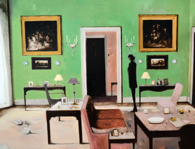
figure. 23 “Parlor” 30×40, oil on board by Geoffrey Johnson – available at Principle Gallery
In Johnson’s interiors, not only are the figures abstracted, but the furniture is often distorted in a few different ways. As you can see in figures #17 and #23 a few pieces of furniture show signs of abstraction. In Velvet Chair the pink velvet chair in the left corner of the room has a stylized slant as does the coffee table on the right in the foreground. While Parlor shows signs in the 2 tables outside of the doorway and the one against the peach colored wall. The legs of the chair mirror the thin appearance of Johnson’s figures. These qualities make Geoffrey Johnson so prolific because he successfully blends the traits of realism and abstraction in his compositions. Viewers appreciate the sophisticated feeling of timelessness and melancholy that emerge from his work.
We hope you enjoyed this brief overview of the progression of abstraction despite us being a gallery that specializes in realism, but it’s always fun to think outside the box!
Geoffrey Johnson’s Solo Exhibition can be viewed in its entirety until this upcoming Tuesday, May 29th and if you can’t make it in time please view the exhibition through this link: http://principlegallery.com/alexandria/artists-page?field_artist_target_id=612&nid=612
If you’re interested in receiving the Geoffrey Johnson Solo Exhibition digital catalog please email us: info@principlegallery.com and we’ll gladly send it your way!


