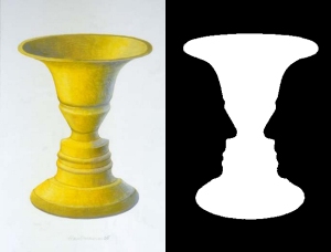
The concept of positive and negative space is a fairly simple one. The subject of a work of art occupies the positive space, while everything else is considered negative space. Nearly every piece of representational art contains positive and negative space. The way that artists make use of positive and negative space to enhance their artworks is less simple, but very visually interesting. Negative space can be used in a number of creative ways, from balancing a composition to focusing the viewer’s eye to adding to the visual interest of the positive space. To start, let’s look at a fairly simple and well known illustration of the concept, called “Rubin’s vase.”

Examples from art history:
Chinese art has always been an excellent example of the use of negative space to create a simplified, quiet, and somewhat “zen” atmosphere in a work. Especially with traditional calligraphic painting, the delicate use of black ink meant that utilizing the negative space well could be extra eye-catching and effective. As art has progressed, many well known artists have incorporated a deliberate use of negative space to add interest to a composition and to enhance the mood of a work. Check out how the negative space balances and affects the mood of these works:

(left to right) Wang Hui, “Ancient Temple in the Mountains” 17th century; Johannes Vermeer, “Young Woman with Water Pitcher” 1662 ; Francisco Goya, “Courtyard with Lunatics” 1794; Edgar Degas, “Ballet Rehearsal” 1873
Art in the twentieth century has seen a bit of a different and new trend when it comes to the use of negative space, as artists begin to play with optical illusions and the creation of images with the negative space itself. (This has become an even bigger trend within the realm of graphic design, and is a technique often utilized with logos, like the arrow formed between the “e” and “x” in the FedEx logo.) Here are some cool examples:

(left) Coles Phillips, “A Young Man’s Fancy” 1912; (middle) M.C. Escher, “Sky and Water I” 1938; (right) Rene Magritte, “Decalomania” 1966
Examples at Principle Gallery:
Everywhere you look here at Principle Gallery, you’ll spy examples of skilled and thoughtful use of negative space. For some artists, however, it is an especially important design element. Consider the work of Laura E. Pritchett:
Laura’s thoughtful and liberal use of negative space as part of her compositions plays a big role in the way these works possess a sense of stillness and peace, as if a moment has been captured. Imagine for a moment if Laura had continued to fill the positive space of these works with more background imagery, more colors and textures and objects. It’d really change the impact of the paintings, don’t you think? You can check out all of Laura’s gorgeous, peaceful work at Principle Gallery on our website here.
Now check out these other awesome pieces at Principle Gallery, and take a moment to consider how and why you think the artist might have played with positive and negative space the way that they did:

(left to right) Valerio D’Ospina, “Rainy Day in NYC”; Colin Fraser, “Highwayside”; Kevin Fitzgerald, “St. Martin Snow”; Mia Bergeron, “Limitless”
For more incredible artwork from Principle Gallery, be sure to subscribe to our blog and follow our social media pages on Facebook, Twitter, Instagram, Pinterest, and YouTube!


