What is it?
Today’s Technique Tuesday post is taking a look at one of the Elements and Principles of Design, rhythm. This can be a tricky concept to wrap one’s mind around when talking about visual arts, but it is very applicable! In reference to audible sound and physical movement, rhythm involves a pattern of sounds and silences, movements and pauses, alternating and repeating, sometimes frenetic and sometimes very calm and slow.
The Elements and Principles of Design (line, form, color, pattern, rhythm, unity, etc.) are the building blocks of art, and when a piece of artwork is analyzed, these are the tools with which we can describe in words what makes an image successful, impactful, and visually pleasing. With every successful image, the eye is led. We’ll do a post soon explaining just what that means and how important it is in visual arts, but essentially it means that artists set up every element on their surface in such a way as to draw a viewer in and lead their gaze around on a certain path.
Rhythm, in reference to visual artwork, describes the way that the elements (line, color, value, composition) flow into one another. There is a movement to the way we experience the image. Thinking of this concept in musical terms is a fascinating and effective way to grasp the ideas more fully. Imagine that as you look at a painting, the movement of your eye results in audible sounds. Would the sequence of sounds be “legato”, a musical term referring to notes that slowly and easily flow into one another, or more “staccato”, which refers to abrupt changes and vivid contrast? “Hearing” the “music” of a painting helps the viewer appreciate more deeply the thoughtful way in which the artist arranged the elements of line, value, etc.
Examples from art history:
Take a look at these works painting by iconic artists throughout history, and try to imagine the sounds and rhythm created by the movement of your eye:
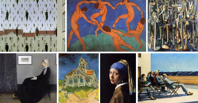
(top row, from left) Rene Magritte, “Golconda”; Henri Matisse, “The Dance”; Wifredo Lam, “The Jungle”; (bottom row, from left) James Abbott McNeill Whistler, “Arrangement in Grey and Black No.1”; Vincent Van Gogh, “Church at Auvers”; Johannes Vermeer, “Girl with a Pearl Earring”; Edward Hopper, “People in the Sun”
Examples at Principle Gallery:
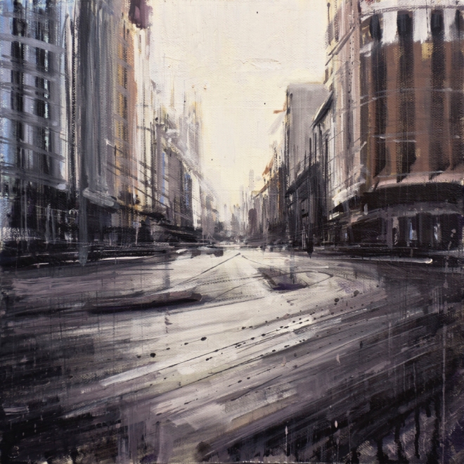
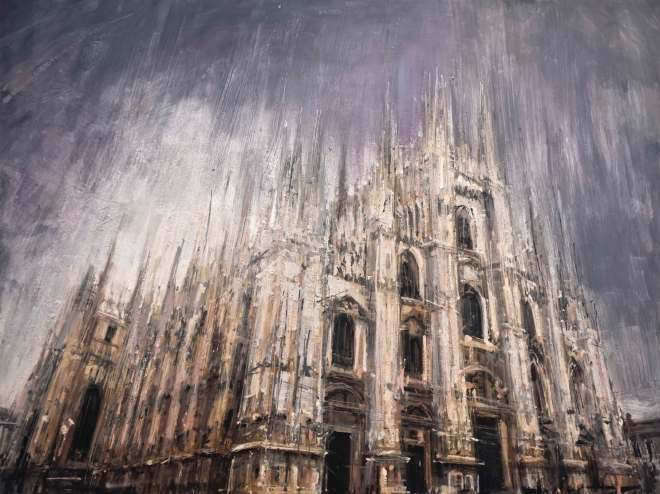
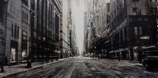
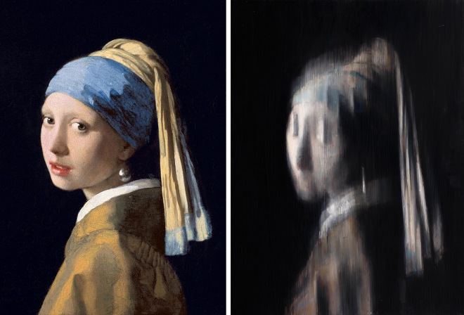
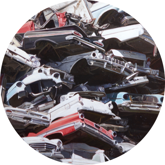
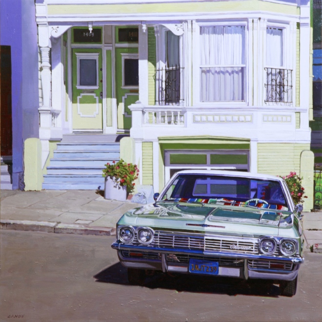
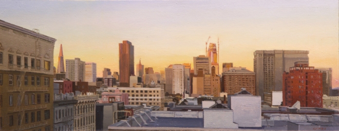
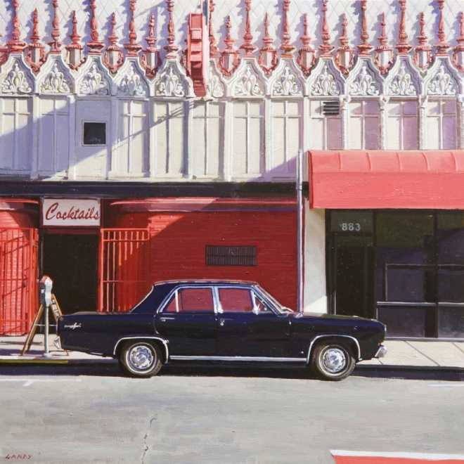
Two years ago, Principle Gallery held an exhibition featuring artists Valerio D’Ospina and Greg Gandy, and titled the show “Tempo and Pause”– this was indeed a reference to the contrast and variety of rhythm found in the works of these two painters. We’ve just opened another exhibition this year featuring these two incredible artists, and the contrast in rhythm is just as striking and fascinating! Both artists make use of this Principle of Design, with incredibly different methods and incredibly different results. If you haven’t yet, we highly recommend coming to see it in person! If you’re unable to, however, definitely make sure to check out the whole show on our website here, and email us at info@principlegallery.com for a full digital PDF preview. Once again, take a look at some of the works in the show and keep rhythm in mind– the variety and intricacy is fascinating! (I’ll also throw in a comparison between Vermeer’s “Girl with a Pearl Earring” and Valerio D’Ospina’s blurred homage to it– very different rhyhtms!)

