As promised last Tuesday, we are going to continue our discussion on color theory. Apart from how they interact with one another, colors have the capability to attract a viewer due to their emotional and psychological effects. From how they are paired together to where they are placed in the picture space, this artistic attribute is more powerful than you would think. So without further ado, here’s color theory part two!
What is it?
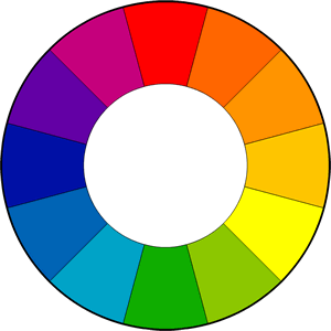
To have a recap on color theory, follow this link to be brought to our explanation from last week! As mentioned in the previous post, colors can be categorized as either warm or cool by splitting the color wheel down the middle – warm colors on the right, with cool colors on the left.

One of color’s functions within an artwork is to define spatial depth. Warmer colors tend to propel forward in space, whereas cooler colors rest in the background. The placement of these colors can intensify a composition and draw a viewer’s attention to certain aspects. For example, works that employ a monochromatic color scheme – one hue with the addition of black and white – have the opportunity to apply a focus point.
In cases like Geoffrey Johnson‘s paintings where Impressionistic black figures appear before golden cityscapes, there is an establishment of space as well as an increased focus on the figures due to the color juxtaposition. What makes Johnson’s work so interesting – and also successful – is that he redefines warmer and cooler colors. The warm golden colors, as seen in his studies below, remain in the background while black protrudes to the foreground. He accomplishes a familiar cityscape with anonymous individuals by using an atypical technique – the reversal of colors’ roles.
- SOLD
Colors not only contribute to how a work presents spatial depth, but they also affect your mood and the ambience of a piece.Without going into too much scientific detail, a color’s wavelength and how it is received into the eye can impact our emotions. Those with the shortest wavelengths, such as purple, blue, and green, tend to evoke tranquil feelings, while colors with longer wavelengths cause irritation. Studies have shown that the reason behind this behavior is due to how a color can strain our vision, i.e. the shorter the color’s wavelength, the lesser amount of stress caused upon us to perceive that color. For instance, yellow has one of the longest wavelengths, straining our visual reception of it and causing anxiety.
Examples in Art History:
One of the most renowned artists who incorporated color psychology in his works is Mark Rothko, a modern, abstract expressionist painter. Wanting his viewers to become immersed in color and feel their effects, Rothko painted large, wall-lengthed canvases of highly saturated, vibrant colors in rectangular forms. He would typically paint large blocks of similar hues upon one another to illustrate intense color pairings and their visual tension or contrast. The intention behind this composition was to have the viewer become engulfed in the purity of the painted hues, such that they have an emotional experience.
“I want to express basic human emotions – tragedy, ecstasy, doom…The people who weep before my pictures are having the same religious experience I had when I painted them.” –Mark Rothko
If you wander through a Mark Rothko exhibit at the Phillips Collection or another modern art gallery, you’ll notice the pieces hang lower to the ground and are typically in more confined spaces. This curatorial decision was chosen by Rothko, for this was how he both envisioned and painted his works. You’ll also notice that in comparison to other artworks you’re allowed to be closer to the paintings- 6 to 8 inches actually. Again, this is purposeful and necessary to manifest an artistic, emotional experience with the piece. It was Rothko’s trademark to create such an emotional effect on his viewers through visual perception.
Examples at Principle Gallery:
Arguably, Principle Gallery artist, Kevin Fitzgerald, employs color psychology in his abstract, landscape paintings. Though not an abstract expressoinist like Rothko, Kevin’s work still evokes emotional experiences in a different abstract technique called tonalism. This method of painting revolves around using a color’s middle value, as opposed to its heavily saturated hues, to create an atmospheric, soft haze (check out this link for a more in-depth explanation). Similar to Rothko’s paintings, the combination of colors in Kevin’s work can influence a viewer’s emotional state as well. Due to his application of tonalism, Kevin’s landscape paintings successfully impact the viewer in a tranquil, therapeutic sense.
To experience such a moving opportunity, we invite you to see Kevin Fitzgerald’s beautiful works at his annual solo exhibition this Friday! Principle Gallery is holding an opening reception starting at 6:30PM that is free and open to the public. We hope you are able to come and engage with his works with your newly acquired knowledge of color theory!


